Most streamers think of the offline screen as the least important visual on their channel. It is the one they spend the least time looking at, the one viewers see least often during a stream, and the one most overlay packs treat as an afterthought. Almost every part of that intuition is wrong. The offline screen is, paradoxically, one of the most-seen visuals on your channel by people who are not yet your followers — and along with your channel trailer and panels, it is one of your channel's main conversion surfaces. Its job is not entertainment. It is to turn a stranger into a follower.
This guide covers what an offline screen actually does, who is looking at it (it is not who you think), what should go on it, what should never go on it, the correct technical specs, and why this single piece of design quietly drives more channel growth than the bigger and louder pieces most streamers obsess over.
- What an offline screen actually is
- Who actually sees your offline screen
- Its real job: convert visitors to followers
- What to put on an offline screen
- What to leave off
- Size, resolution and technical specs
- Six common offline screen mistakes
- What good offline screens have in common
- How to set yours on Twitch
What an offline screen actually is
An offline screen, sometimes called an "offline banner" or "offline image", is the visual that fills the video player on your Twitch channel page when no Channel Trailer is uploaded and no recent VOD is available to autoplay. It takes up the entire 16:9 player area as a still image.
This is an important detail most guides skip: since Twitch's 2020 channel page redesign, when a non-follower lands on your offline channel, the player auto-plays in this priority order:
- Your Channel Trailer if you've uploaded one (autoplays for non-followers, up to 60 seconds)
- Your most recent VOD with an "OFFLINE — Check out this stream from X days ago" overlay, if no trailer exists
- Your offline screen (the static image), only if neither of the above exists
This means the offline image is a fallback rather than the default offline display. If you want the offline screen to be what visitors actually see, you need to leave the Channel Trailer field empty and have no recent VODs available — or accept that the offline image is one of three offline-channel surfaces, not the only one. The offline image still matters: it is the visual that anchors the channel for streamers without a trailer, and it is what visitors see once a recent VOD ages out of view.
The offline screen is a single static image uploaded to Twitch's channel branding settings. It sits in your channel page's "Video Player Banner" field and renders as a still image whenever the trailer/VOD fallback chain has nothing else to play. There is no live playback, no looping animation, no embedded video; whatever JPG or PNG you upload is what every visitor sees, every time, until you replace it.
The offline screen is technically a different asset from the BRB screen and the Ending screen, even though all three look superficially similar. The BRB and Ending screens play inside your live broadcast through OBS or Streamlabs, which is why they can be animated. The offline screen lives on your channel page when no stream is happening at all and is uploaded directly to Twitch as a static image. Each has a different audience, a different delivery mechanism, and a different job, even though they often share visual language.
Who actually sees your offline screen
This is the part most streamers get wrong. The intuition is that the offline screen is mostly seen by your existing followers when they happen to land on your channel between streams. The reality is the opposite.
Your existing followers know your stream schedule. They mostly visit your channel when you are live, not when you are offline. They know what you do, they know where to find you, they have already followed. The offline screen is a less critical version of your channel for them — though Twitch's December 2025 notification overhaul (which replaced binary On/Off with Always / Personalized / Highlights / Off, with existing followers auto-migrated to Personalized) means go-live pings are now algorithmically filtered, so a non-trivial share of your followers may visit your channel offline because they did not get notified you went live.
The people who see your offline screen most are strangers who landed on your channel for the first time. They got there from a TikTok clip, a YouTube highlight, a Twitter mention, a Reddit thread, a friend's recommendation, a Twitch search, or an outbound link from a clip or VOD during a moment when you happened not to be live. (Twitch's main category and game directories list only live channels, so they aren't a path to an offline channel — but search results, follow lists, suggested-channel sidebars, and external links all are.) These people have no idea who you are, what you stream, when you stream, or whether they should follow you. The offline screen is their entire first impression of your channel.
For an established streamer with significant clipped content traveling outside Twitch, the share of "first-time visitor sees offline screen" relative to "follower sees offline screen" is plausibly very high — Twitch does not publish offline-page analytics segmented by follower status, so the exact ratio is unknown, but the structural argument holds: if your clips travel and your live broadcast hours are limited, most offline-page views will come from people who do not yet follow you. This is a conversion surface, not a decoration.
Its real job: convert visitors to followers
Once you accept that most of the audience for your offline screen is people who do not yet follow you, the design priorities flip. The offline screen does not need to entertain. It does not need to be beautiful for its own sake. It needs to answer four questions for a stranger in under five seconds:
- Whose channel is this? Channel name, logo, identifying mark.
- What do they stream? A few words about the content. Not a full bio.
- When are they live next? A schedule the visitor can act on.
- Where else can I find them? Social handles for cross-platform follow.
An offline screen that answers all four of these is doing real work. An offline screen that just shows a logo on a pretty background is leaving conversion on the table. The most beautiful offline screen in the world fails its actual job if it does not tell a stranger when to come back and where else to find you.
What to put on an offline screen
- Channel name / logo as the dominant visual element
- One-line tagline describing what you stream (e.g. "Tactical FPS & viewer games", "Cozy variety & chill chats", "Daily speedruns & community marathons")
- Stream schedule with timezone (e.g. "Mon, Wed, Fri 8PM GMT" or "Every weekday from 7PM CET")
- Three to five social handles with platform icons (Twitter/X, YouTube, TikTok, Instagram, Discord)
- A small "currently offline" indicator so visitors immediately understand they are not seeing a frozen stream (note: Twitch already overlays its own OFFLINE pill on the player, so a custom indicator is optional and many designers skip it to avoid duplication)
The trick is fitting all of this on the screen without making it feel like a billboard. The mistake most streamers make is leaving everything off in the name of clean design, which solves an aesthetic problem at the cost of every conversion goal. The opposite mistake is cramming the screen with seven calls to action, three taglines, and a wall of text that no one will read.
The clean way to do it is hierarchy. The channel name and logo are big and centred. The tagline sits just below them. Schedule sits in a smaller text block, often in a corner. Social handles run as a small icon row at the bottom or along one side. Each element gets the visual weight that matches how important it is.
Show your local timezone next to your schedule, not "GMT" or "UTC". Most viewers do not mentally convert timezones in real time. "8PM GMT (3PM EST / 12PM PST)" gets you the international audience without making them work for it. If you only stream to one region, just use the local time and skip the conversion.
What to leave off
The temptation when designing an offline screen is to include every piece of information you might possibly want to communicate. This is wrong. The screen has limited space and limited time before a visitor leaves. Things that should not appear:
- Your full biography - Twitch already has a dedicated About section for this
- Sponsor logos - sponsors are temporary, the offline screen is more permanent than your sponsor list
- Loud "FOLLOW ME!" calls to action - the follow button is right there on the page already
- Every social platform you have ever used - pick three to five, not nine
- Achievement lists - "Top 0.1% Apex player, 500-day Twitch sub streak" is for your About section, not the offline screen
- Subscriber-only emote previews - these belong in the panels under the player
- Email addresses or business contact info - also goes in the About section, not the public-facing visual
The principle: the offline screen answers "who, what, when, where else". Anything beyond those four questions belongs in the channel panels below the video player, not in the offline screen itself.
Size, resolution and technical specs
The technical specs for an offline screen are stricter than most streamers realise, and uploading the wrong size is the easiest avoidable mistake. Here are the specs that work in 2026:
| Setting | Recommended value | Notes |
|---|---|---|
| Resolution | 1920 x 1080 | Matches Twitch player default; 4K acceptable but downscaled by Twitch |
| Aspect ratio | 16:9 | Non-negotiable; anything else gets letterboxed or stretched |
| File format | JPG or PNG | JPG for photographic backgrounds; PNG for graphics with sharp edges or limited colour palettes |
| Max file size | 10 MB | Twitch hard limit; aim for under 5 MB to keep image quality high after Twitch's compression |
| Colour space | sRGB | Twitch displays in sRGB; designing in another colour space causes shifts on upload |
| Safe zone | Middle 80% of frame | Mobile crops can hide edges; keep the schedule, handles and logo away from corners |
| Bottom-left corner | Keep clear | Twitch overlays a small "Offline" badge and channel name here; design around it |
The 10 MB cap is generous for a single still image, so the practical constraint is not file size but readability: at 1920 x 1080 the screen looks sharp on desktop but will be displayed at much smaller sizes on mobile and in embeds elsewhere. Design every text element to remain legible at one-third the source size.
Six common offline screen mistakes
1. Treating it as decoration rather than conversion
The most common failure mode. The screen looks beautiful but does not tell a stranger when to come back or where else to find you. Beautiful and useless is still useless.
2. Hiding the schedule
The single most actionable piece of information on the screen is your schedule. If a stranger likes your channel but does not know when to come back, you have lost them. Make the schedule large enough to read at a glance from a phone screen.
3. Using only platform icons with no handles
Icons without handles are useless. A Twitter bird icon does not tell the visitor what your handle is, and Twitch does not link the icon to your account automatically. Show the handle text alongside the icon, or skip the icon entirely.
4. Designing it before the brand identity is settled
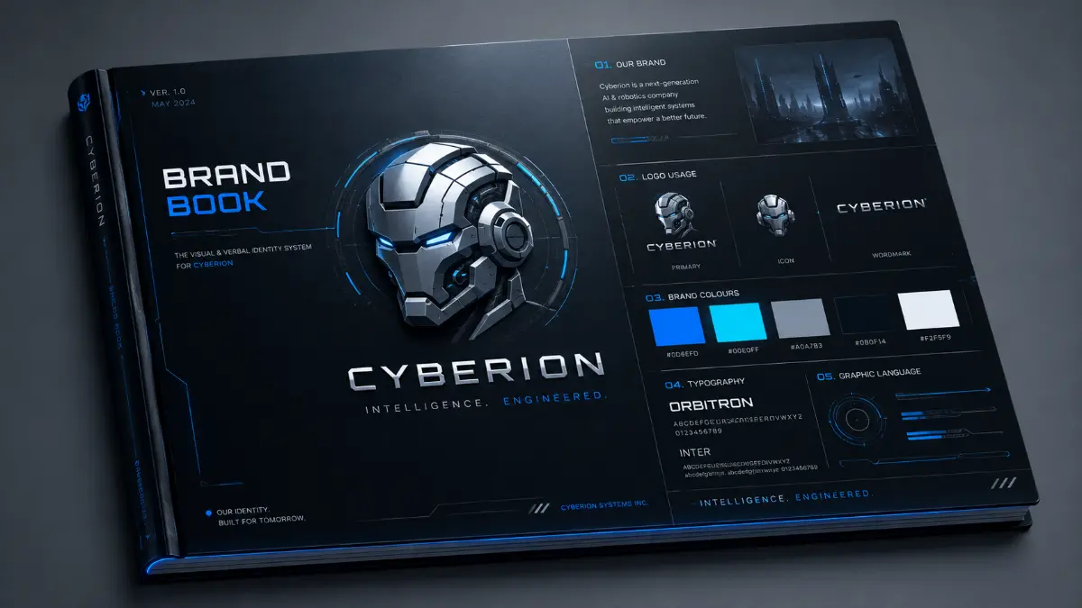
An offline screen that uses different colours, typography or scene language from the rest of the channel reads as inconsistent. Build the offline screen as part of a coordinated set with the rest of your visual identity, not as a one-off. We have a separate guide on building a cohesive stream brand if you have not already worked through that.
5. Forgetting to update it after a rebrand
The offline screen is one of the easiest assets to forget about. You rebrand the rest of your channel and the offline screen quietly keeps showing your old logo, your old schedule, your dead Twitter handle. Every time you update your stream visuals, audit the offline screen.
6. Not testing on mobile
A lot of first-time visitors arrive from a TikTok or YouTube clip on their phone. Twitch mobile crops and resizes the offline screen differently from desktop. If your schedule and handles are positioned in the corners of the frame, mobile users may not see them. Always preview on a phone before uploading.
What good offline screens have in common
Across the offline screens we have seen work well for streamers in the high-thousands and above follower range, the patterns are consistent:
- One dominant visual element (logo, character, environment) anchors the composition
- Schedule and handles are visible without needing to scroll, zoom or squint
- The visual style matches the streamer's other branded assets exactly
- There is air around the elements; nothing is crammed against an edge
- The colour palette is the channel's signature palette, not a deviation
- Total reading time for everything on screen is under 8 seconds
- It looks finished on mobile, not just on desktop
None of these are particularly hard to achieve, which is why the gap between a good offline screen and a poor one is mostly a gap of intentionality rather than budget.
How to set yours on Twitch
Setting an offline screen on Twitch is straightforward but the menu has moved over the years and is not where most streamers expect it. As of 2026:
- Log in to Twitch and click your profile picture, top right
- Choose
Creator Dashboardfrom the menu - In the left sidebar, expand
Settingsand clickChannel - At the top of the Channel settings page, click the
Brandtab - Scroll down to the
Video Player Bannerfield — this is the offline screen - Click
Updateand upload your file - Allow ~15 minutes for the change to propagate; if you don't see it, clear your browser cache or open the channel in an incognito window
If your file is rejected, the most common reason is exceeding the 10 MB cap or uploading something other than a JPG or PNG. Reduce the image's resolution or compress it harder and try again.
The takeaway
The offline screen is the lowest-budget, highest-leverage visual on your channel for converting first-time visitors into followers. It is seen disproportionately by people who do not yet know you, and it is the only static visual that has a real conversion job. Designing it as a "who you are, what you stream, when you stream, where else to find you" billboard rather than as decoration is the single biggest improvement most channels can make to their offline page.
If your current offline screen is just a logo on a background with no schedule and no handles, replace it. It is leaving real follower growth on the table every day you are not live, which is most days.