Most streamers do not build a brand. They accumulate one. They pick a username, find a logo on Fiverr, choose a colour they like for their alerts, download an overlay pack with completely different colours, commission a Starting Soon screen from someone else, and end up with five visual identities all fighting each other across the same channel. The result is a stream that does not look bad in any single piece, but never looks like one cohesive thing.
A real brand identity is the opposite. It is a set of rules, decided up front, that every visual decision afterwards has to follow. Every overlay element, every alert, every Starting Soon screen, every social media graphic, every clip thumbnail uses the same logo, the same colour palette, the same typography, the same visual mood. The viewer might not consciously notice this consistency, but they absolutely feel its absence, and consistency is the single biggest signal that separates a hobby channel from a professional one.
This guide walks through the five pillars that make up a stream brand and how to design each one so they hold together. It is written for streamers who are either starting from scratch or partway through a channel and realising the visual identity has drifted. Either case is fixable.
Why cohesion matters more than individual elements
A useful way to think about brand cohesion is the way a film production designer thinks about a film. A great film does not just have great costumes, great sets, great cinematography, great music. It has costumes, sets, cinematography and music that all feel like they belong to the same world. A red dress in a Wes Anderson film looks different from a red dress in a Christopher Nolan film, not because the dresses are inherently different, but because the surrounding world has decided what red means. The dress fits because the world decided.
A stream is the same. Your logo is not in isolation. It sits inside a webcam frame that sits inside an overlay that sits inside a 3D environment that animates differently from the alerts that pop up over the top. If those five layers were each commissioned separately from five different designers with no shared brief, none of them will have agreed what the world means. The pieces will look fine in isolation and clash in combination.
The fix is not to spend more money. It is to make brand decisions before you commission anything, and then hold every piece you commission afterwards to those decisions. A clear brand document is the single highest-leverage hour you will spend on your channel's visuals.
Pillar 1: Logo
The visual anchor for every other piece
Your logo is not just a graphic that goes on your channel banner. It is the single visual element that has to work at every size, on every background, in every context: a 32px favicon in a browser tab, a 1080p watermark on a clipped Short, a giant element in a Starting Soon screen, a tiny mark in a chat overlay corner. If your logo only works at one size, it is not finished.
A working stream logo should have:
- A primary version that contains your full streamer name and any decorative elements
- A simplified mark that strips out the wordmark and works at small sizes (favicons, profile pictures, watermarks)
- A monochrome version for situations where colour does not work (single-colour print, dark backgrounds, light backgrounds, embossed merch)
- An animated version for stream intros and transitions, ideally with both a 1-2 second build and a continuous loop variant
If you are commissioning a logo and the designer only delivers one file at one size, you have not bought a brand asset. You have bought a graphic. Insist on the full kit. Our Logo Design service ships every commission with all four variants by default, plus an additional animated logo build if you want movement for stream intros.
Pillar 2: Colour palette
The system that makes everything else feel related
If there is one thing that ties a stream brand together more than any other, it is colour. Two pieces of design with completely different shapes, fonts and styles can still feel like they belong to the same brand if they share the same colour palette. Two pieces of design with identical shapes will feel disconnected if their colours fight.
A good stream brand colour palette has four roles:
| Role | Purpose | Example use |
|---|---|---|
| Primary | The signature colour of your brand | Logo highlights, key accent on overlays, alert colour |
| Secondary | The complementary colour | Secondary highlights, hover states, secondary text |
| Neutral dark | Background and atmosphere | Dark backgrounds, scene shadows, depth |
| Neutral light | Text and contrast | Body copy, panel text, light highlights |
That is four colours. Resist the urge to add more. Most amateur brands use seven or eight colours and end up looking chaotic. Most professional brands use three or four and feel intentional.
For your primary colour, lean toward something distinctive rather than something safe. Almost every gaming brand defaults to red, blue or green. If you choose teal, magenta, gold, electric purple or burnt orange, you immediately stand out in a feed of competing channels. The colour that feels slightly bold to you is usually the right answer.
Store your palette as hex codes in a single document. Every designer you work with afterwards should get those exact codes, not a screenshot or a description like "kind of a dark blue". The difference between #0066CC and #1A73E8 looks tiny in isolation and looks huge when one piece uses one and another uses the other.
Pillar 3: Typography
The voice your brand reads in
Typography is the most under-considered pillar in stream branding, and the gap shows immediately when you look at amateur channels. The Starting Soon screen uses one font. The overlay panel uses another. The alert popup uses a third. The channel panels on the Twitch web layout use a fourth. The result is a brand that visually mumbles instead of speaking.
A solid stream brand uses two fonts at most:
- A display font for headings, your logo wordmark, big screen text. This is the font that defines the personality of your brand. Bold, distinctive, often unusual.
- A body font for everything else. Channel panel text, smaller overlay labels, captions, FAQ content. Should be clean, readable, neutral.
Picking the display font is the personality call. Some directions:
- Geometric / sci-fi: Orbitron, Audiowide, Saira, Exo. Reads as futuristic, technical, gaming-forward.
- Industrial / technical: Rajdhani, Russo One, Teko. Reads as clean, modern, sport.
- Cinematic / serif: Cormorant, Playfair, Bodoni. Reads as elevated, dramatic, prestige.
- Hand-drawn / personality: Permanent Marker, Bangers, Caveat. Reads as casual, fun, approachable.
- Anime / kawaii: M PLUS Rounded, Rampart, Reggae One. Reads as energetic, cute, VTuber-adjacent.
For body, almost any clean sans-serif works: Inter, Manrope, DM Sans, Roboto, Outfit. Resist using your display font for body text. Display fonts are tiring to read at small sizes.
Once you have picked, use the same two fonts everywhere. Channel banner. Overlay text. Starting Soon screen. Newsletter. Discord server. Merch. The repetition is what makes the brand feel cohesive.
Pillar 4: Tone of voice
How your brand sounds when it speaks
Tone of voice is the only one of the five pillars that is not visual, but it might be the one that most affects how viewers remember you. The way your channel writes its panels, its alerts, its socials, its merch listings shapes the viewer's mental picture of who you are as much as the visuals do.
The tone of your written brand should match the visual tone. A brand with cinematic 3D environments, a serif logo, and a moody colour palette should not have an alert that says "POG! Thanks for the follow bestie!". A brand with a chibi VTuber model and pastel pink palette should not have channel panels written in cold corporate copy.
Pick a tone direction and apply it everywhere:
- Cinematic: short, dramatic, first-person, sparing punctuation. "The stream begins shortly." "Welcome back." "Something is coming."
- Casual / friendly: warm, conversational, second-person. "Hey, glad you're here. Stream starts in a sec." "Thanks for hanging out."
- Edgy / streetwear: short, punchy, occasional all-caps, lifestyle vocabulary. "Locked in." "Back from the run." "Fresh drop incoming."
- Cute / kawaii: diminutives, soft punctuation, expressive emoji. "Welcome welcome (◕‿◕)" "thank you nyaa~"
- Pro / sport: direct, confident, brief. "Tournament prep." "Run #4." "GG."
The specific direction matters less than the consistency. A channel that picks a tone and holds it for two years is a channel viewers can predict, and predictability builds attachment.
Pillar 5: Scene language
The world your stream takes place in
Scene language is the one pillar that is unique to streaming. Most other personal brands (musicians, designers, businesses) do not have to design a fictional world for themselves to inhabit. Streamers do. The Starting Soon screen, the BRB scene, the offline screen, the main background during Just Chatting - all of these together constitute the world your viewer believes the stream takes place in.
A consistent scene language answers questions like:
- Where does the stream live? A bedroom? A spaceship? A neon city? A forest cabin? A studio bunker? An abstract void?
- What time of day is it? Always sunset? Always night? Mid-afternoon golden hour? Underground with no daylight at all?
- What is the weather or atmosphere? Misty? Dry? Raining? Snowing? Holographic? Hot and dusty?
- What objects appear repeatedly? Books? Plants? Weapons? Computers? Crystals? Trophies? Nothing at all (minimal)?
- How does the camera move? Static? Slow drift? Cinematic dolly? Handheld? Reactive?
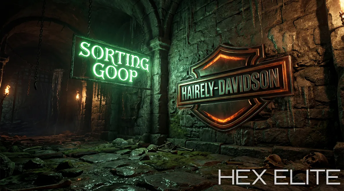
The answers should be the same across your Starting Soon, BRB, Intermission and Ending screens. If your Starting Soon takes place in a neon Tokyo back-alley at night and your BRB takes place in a sunny medieval tavern, you do not have a brand. You have two unrelated scenes.
The cleanest way to enforce this is to commission your scene set as a coordinated package rather than piece by piece. For more on the difference between standalone scenes and recurring backgrounds, see our guide on stream overlays vs stream backgrounds.
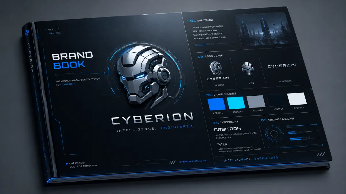
The brand document: write it down
Once you have made decisions on all five pillars, write them down. Not in your head. Not in a Notes app. In a single, shareable document that any future designer or collaborator can read in 5 minutes and immediately produce work that fits your brand.
A minimum-viable stream brand document contains:
- Channel name and tagline
- Logo files (primary, mark, monochrome, animated) with download links
- Colour palette with exact hex codes for primary, secondary, neutral dark, neutral light
- Display font name + body font name, with where each is used
- Tone of voice with three example sentences (one for an alert, one for a channel panel, one for a social caption)
- Scene language description: place, time, atmosphere, recurring objects, camera style
- Three reference images that capture the overall vibe
Keep it to one page or one short Notion document. The discipline of fitting it into one page forces you to make actual decisions rather than vague preferences. Anyone you commission afterwards (overlay designer, scene artist, merch printer, video editor) gets that document at the start of the project. The brief writes itself.
Five common branding mistakes
1. Picking everything from references rather than principles
"I want it to look like XQC's brand but with my colours" is not a brand. It is a copy. Reference is fine for direction but every decision should be defended against your specific channel's identity, not someone else's.
2. Letting the logo do all the work
Many streamers spend 90% of their visual effort on the logo and 10% on everything else. The logo is the smallest part of what viewers see. The Starting Soon screen, BRB scene and overlay are 95% of the viewer's actual visual experience. Spend proportionally.
3. Changing the brand every six months
Visual fatigue is mostly imaginary. You are sick of looking at your branding because you see it 40 hours a week. Your viewers see it for the first time every time they catch a clip. Brands that hold for two-plus years build recognition that constantly-rebranding channels never accumulate.
4. Treating each platform as a different brand
Twitch, YouTube, TikTok, Twitter, Discord and merch should all read as the same brand. Different shapes are fine (square avatar vs landscape banner) but the colour palette, typography and logo should be identical across all of them. A streamer with a moody dark Twitch and a pastel pink TikTok is not branding two platforms differently. They are confusing the audience.
5. Skipping the brand document
Without a written document, every new designer you commission has to reverse-engineer your brand from your existing pieces, and they will get details wrong. Inconsistency creeps in piece by piece. Six months later you have eight pieces of design that almost-but-not-quite match. The brand document is what prevents this.
The right order to build the pieces in
If you are starting from scratch, build in this order:
- Channel name and tagline (you have probably already done this)
- Colour palette (because it constrains everything that comes next)
- Typography (because it pairs with the palette)
- Logo (designed using the palette and typography)
- Tone of voice (informed by the visual direction)
- Scene language (the world the brand inhabits)
- Stream visuals (Starting Soon, BRB, Ending, Background)
- Overlay package (designed to sit cleanly inside the scenes)
- Cross-platform extensions (banners, panels, social graphics, merch)
The order matters because each piece constrains the next. Designing the logo first is a common mistake; without a colour palette and typography to work inside, the logo ends up driving every other decision and frequently does not survive the pressure. Decide the rules before you design the assets.
The takeaway
A cohesive stream brand is not a luxury for big streamers. It is the highest-return investment any growing channel can make in its visual identity, because every piece you commission afterwards will be cheaper, faster and better when it has clear constraints to work inside. The streamers who feel most "professional" to viewers are not the ones spending the most money. They are the ones whose pieces all agree with each other.
Spend an hour writing the brand document. Hold every future commission to it. Two years from now you will have a brand viewers recognise from a thumbnail, and the cost of getting there will have been a fraction of what most channels spend cycling through mismatched pieces.